Baqaala
Your Local Essentials, Delivered with Care.

Problem
In a fast-paced world, consumers increasingly demand convenience without compromising on quality, variety, or sustainability. Traditional grocery shopping often lacks the ease and speed that modern lifestyles require. Many existing delivery platforms focus on speed but fail to address freshness, diverse product offerings, or support for local ecosystems. Additionally, fragmented messaging across social, print, and internal communications can dilute the brand's impact and fail to engage the target audience effectively.
Solution
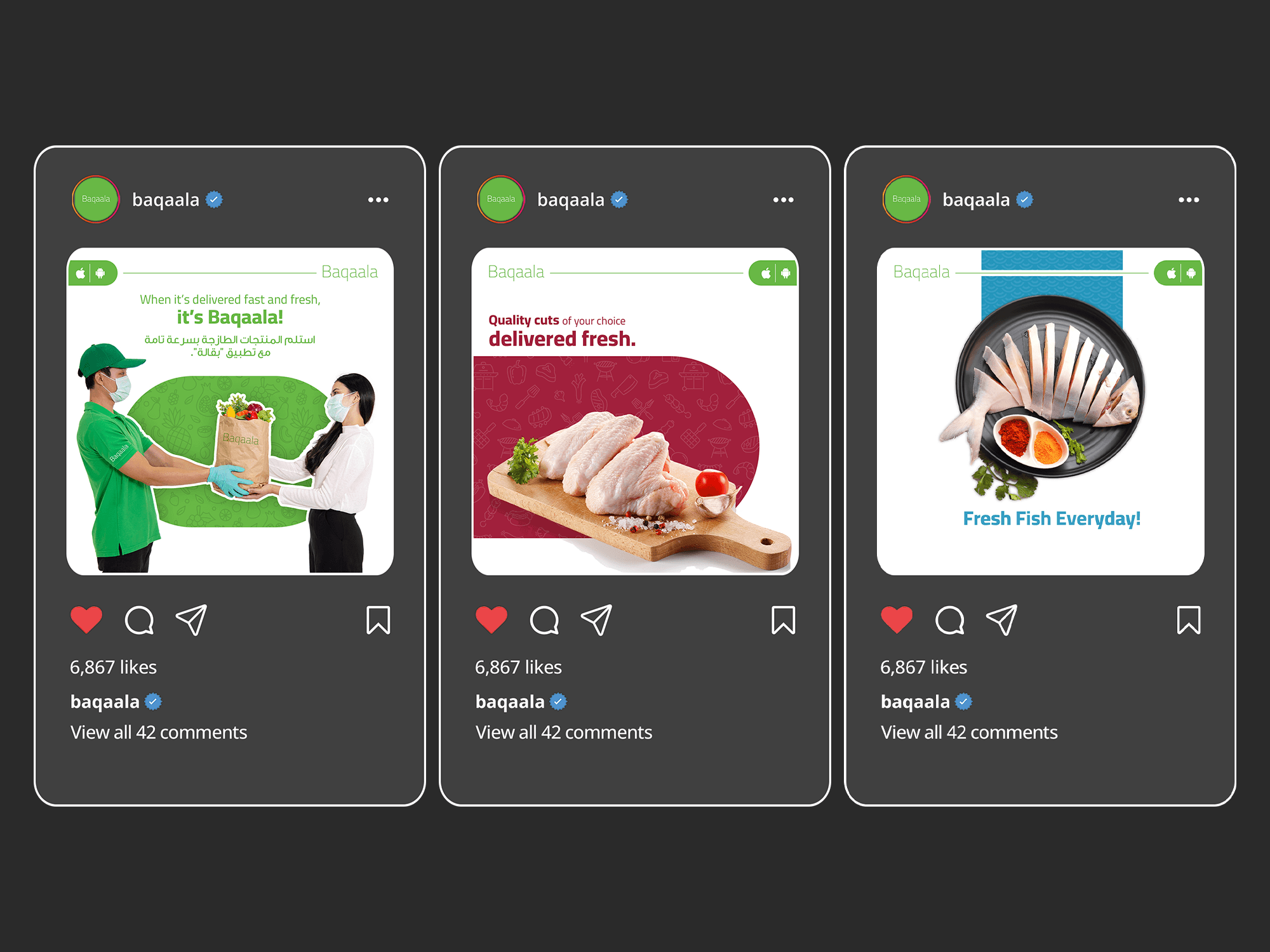
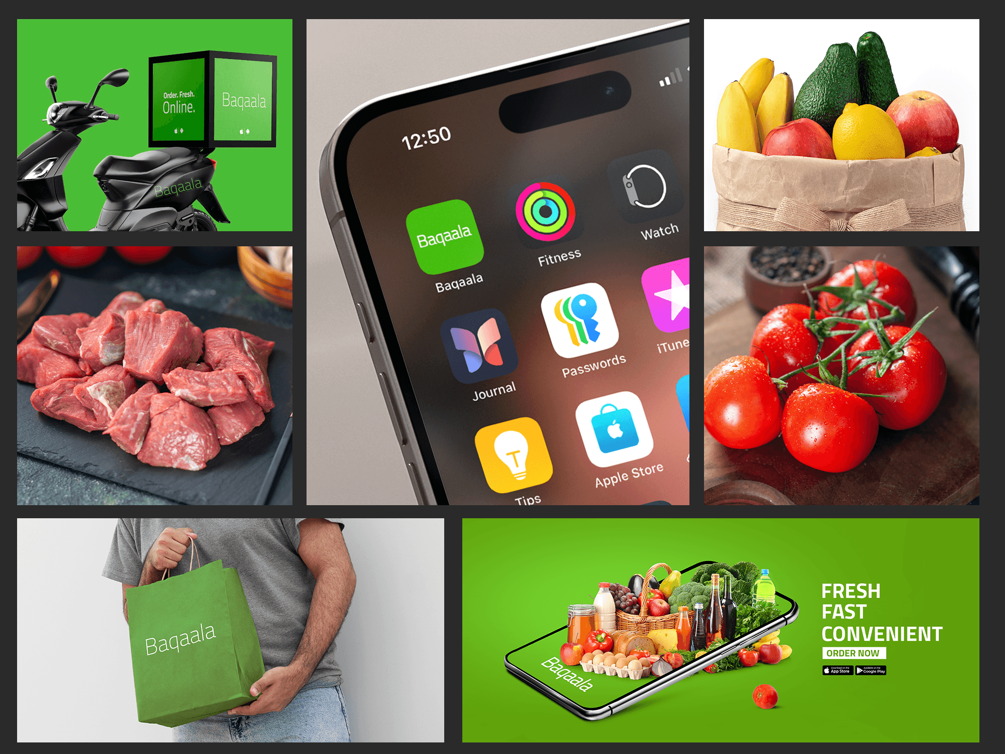
Baqaala elevated its brand identity by emphasizing freshness, quality, and simplicity across all communication platforms. Imagery played a pivotal role, showcasing vibrant, close-up shots of produce like crisp vegetables, juicy fruits, and freshly caught fish, paired with a nature-inspired color palette of greens, yellows, and blues. This visual strategy reinforced the brand’s promise of super-fresh, high-quality products while evoking trust and authenticity. To maintain a modern and approachable aesthetic, Baqaala adopted a minimalist design language. Clean layouts with ample white space, simple sans-serif typography, and intuitive iconography ensured clarity and focus on the products and key messages. The primary color palette, complemented by sparing use of accent colors, highlighted calls-to-action and promotions, creating a cohesive and engaging brand presence. This visual and design strategy was integrated seamlessly across social media, print, and internal communication. Social posts highlighted freshness and convenience with catchy captions and striking visuals, while print materials used high-resolution images and concise messaging to leave a lasting impression. Internally, the same minimalist approach empowered employees to embody Baqaala’s ethos, ensuring a consistent and compelling brand narrative that resonated with customers and built lasting loyalty.

Showcasing Freshness in Imagery
The imagery across social media, print, and internal communication was carefully curated to highlight the freshness and quality of the products.
Close-up shots of vibrant fruits, crisp vegetables, and freshly caught fish created an emotional connection with the audience, evoking a sense of trust in the brand's promise of freshness.
Color palettes were inspired by nature—bright greens for leafy vegetables, sun-kissed yellows for citrus, and ocean blues for fresh seafood—conveying vitality and authenticity.
Minimalist Design Language
Clean Layouts: A minimal design approach was adopted, with ample white space to ensure focus remained on the product visuals and key messaging. This modern, uncluttered aesthetic reflected efficiency and reliability.
Simple Typography: The brand used elegant, sans-serif fonts to maintain a contemporary and approachable feel while ensuring readability across mediums.
Iconography: Subtle, intuitive icons were incorporated to represent delivery, sustainability, and product categories, reinforcing the brand message without overwhelming the visuals.
Colors that Communicate
The brand adopted a primary color palette of fresh greens, warm oranges, and earthy neutrals, symbolizing natural produce, energy, and trustworthiness.
Accent colors were used sparingly to highlight calls-to-action (e.g., “Order Now”) and special promotions, maintaining the overall minimalist aesthetic.
Integrated Messaging
Social Media: Vibrant posts focused on freshness and convenience, with short, catchy captions like “Freshness Delivered,” paired with eye-catching visuals of just-picked produce or a delivery box opening to reveal an array of products.
Print Collateral: Flyers, posters, and brochures used high-resolution images with minimal text, ensuring the visuals spoke louder than words. Key phrases like “Super-Fresh, Ultra-Convenient” were strategically placed to align with the imagery.
Internal Communication: Employees were trained to embody the brand ethos of simplicity and excellence. Internal documents and presentations mirrored the minimalist design language, ensuring brand consistency at every level.
Customer Impact
This holistic approach not only positioned Baqaala as a modern, tech-forward delivery service but also built a strong emotional connection by celebrating freshness and sustainability. The minimalist and vibrant design language ensured the brand stood out in a crowded marketplace, becoming synonymous with quality, convenience, and trust.