Plasticine Pouch Design
For HP

Problem
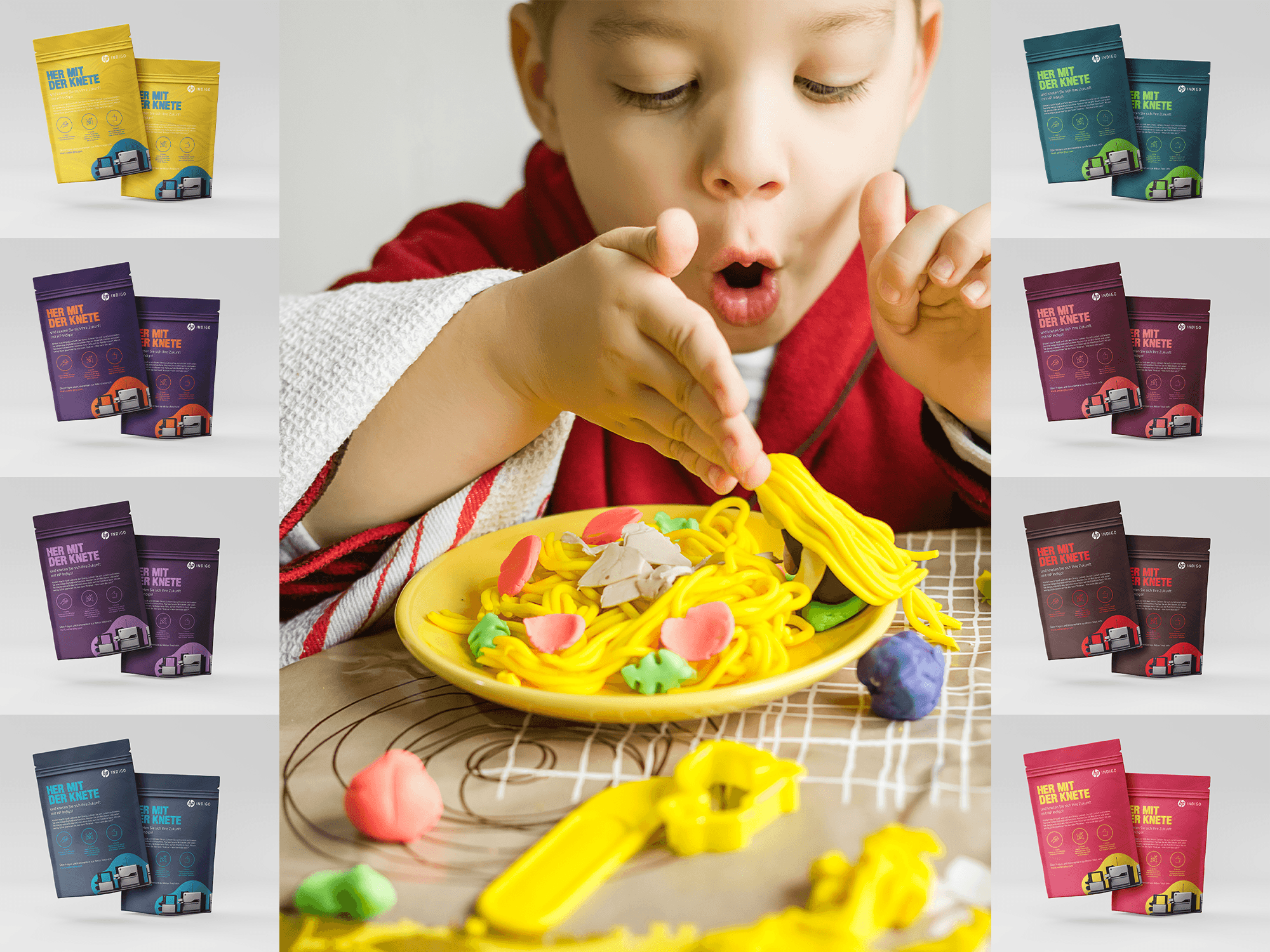
Following the easing of the pandemic, HP Indigo in Germany aimed to reintroduce Plasticine Clay to re-engage children with tactile, creative play in the physical world. The challenge was to break through the digital fatigue experienced by kids who had spent significant time online due to prolonged lockdowns and restrictions. To achieve this, the product needed to stand out in a cluttered market, with packaging and branding that not only appealed visually but also conveyed the playful and hands-on essence of the clay, reigniting excitement and creativity among children.
Solution
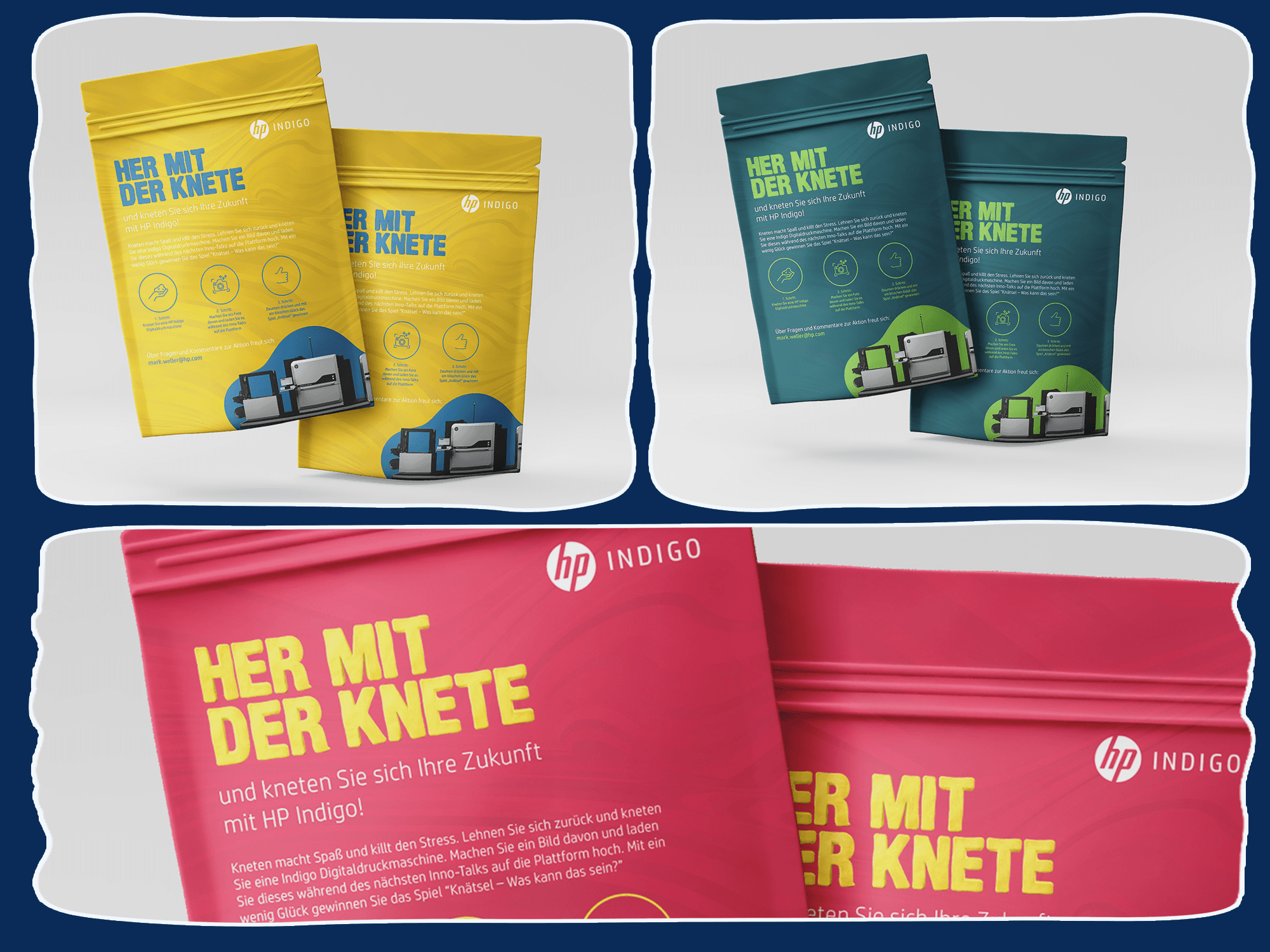
To differentiate plasticine clay and align it with its playful identity, a unique packaging design was developed, and each packet was colored to match the clay inside, creating an immediate visual connection to the product. The design incorporated HP Indigo’s Brand Typography, ensuring brand consistency while enhancing its appeal through a fun and vibrant clay-inspired effect for the headlines. This textured design mimicked the product's tactile nature, emphasizing its interactive and creative essence. The campaign leveraged the product's packaging as a key storytelling element, communicating its purpose of bringing kids back to physical play. By seamlessly blending functional packaging with playful design, HP Indigo successfully created a visually striking product that resonated with both parents and children, making it a standout choice in the post-pandemic world.