Bringing "Care" to Life
Rebranding for the largest Life and Medical Insurance provider in Qatar and the GCC region
Problem
Fragmented Identity. Functional, but Forgettable. Before the rebranding initiative, QLM (Qatar Life & Medical Insurance Company) faced a familiar but critical challenge: the lack of a cohesive visual language that aligned with its brand values and purpose. Key Issues: No Unified Brand System: • Multiple departments and vendors used inconsistent logos, typefaces, color palettes, and messaging—leading to dilution of brand recognition. Dry & Clinical Tone: • The communication lacked warmth or empathy—qualities that are vital for a life and health insurance provider. Visual Ambiguity: • The brand had no distinct look or storytelling device to separate itself from competitors in Qatar’s increasingly competitive insurance sector. Disconnected User Touchpoints: • Marketing, internal comms, digital banners, and corporate documents felt visually and tonally disjointed—confusing for consumers and stakeholders alike. No Human Connect: • A key insight revealed that customers couldn’t feel the brand’s promise of “care”—it was told, not shown.
Solution
A Living Brand Language Built on Care. The solution arrived as a strategic and deeply human rebranding system, detailed in the uploaded brand manual, built from the ground up to express care not just as a value—but as a visual experience. 1. Foundational Storytelling • Rooted the identity in the emotionally resonant belief: “Life insurance is for living individuals.” • This shifted the brand from transactional to transformational—from a product provider to a life partner. ______ 2. Unified Visual Identity • A strong, versatile identity system was designed: • Logo Symbolism: The lotus bloom—symbol of rebirth, resilience, and grace—became the heart of the logo. • Typography: Rounded sans-serif fonts introduced softness and legibility—making the brand feel approachable and credible. ______ 3. Voice with a Heart The tone of voice was reimagined to speak with empathy: • Warm: Replacing jargon with human-first phrasing. • Personal: Talking to people, not at them. • Helpful: Guiding users with clarity and compassion. • Simplified: Making policies and benefits digestible, not daunting. ______ 4. Cohesive Systems & Templates Consumer vs Corporate Assets: Tailored visual styles to serve the needs of both audiences without fracturing the identity. Shape Language: • Fluid, organic forms to reflect real life in consumer messaging. • Structured, geometric shapes to project stability and expertise in corporate use. ______ 5. Digital-First Execution Templates for: • Web banners • Social posts • Internal presentations • Print brochures Ensured that every brand impression feels intentional, intelligent, and inspired. __________________________________________ From a scattered visual presence to a unified, empathetic, and powerful brand expression—QLM now looks, sounds, and behaves like a life-first insurance provider. A system that not only tells you it cares... But shows you, every step of the way.

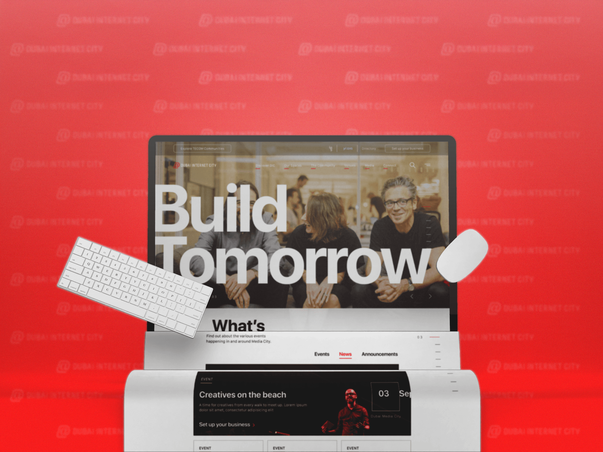
On The Web
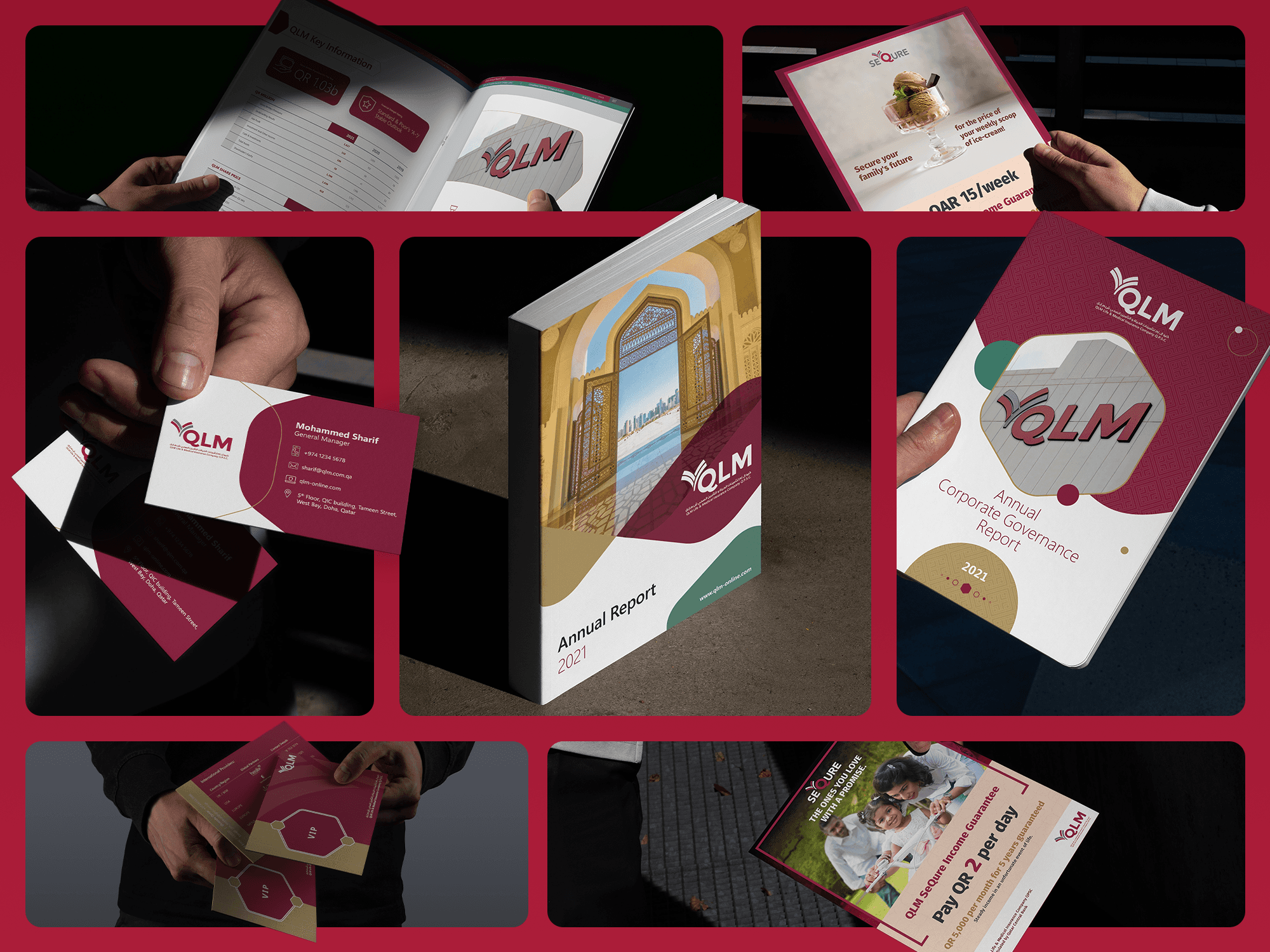
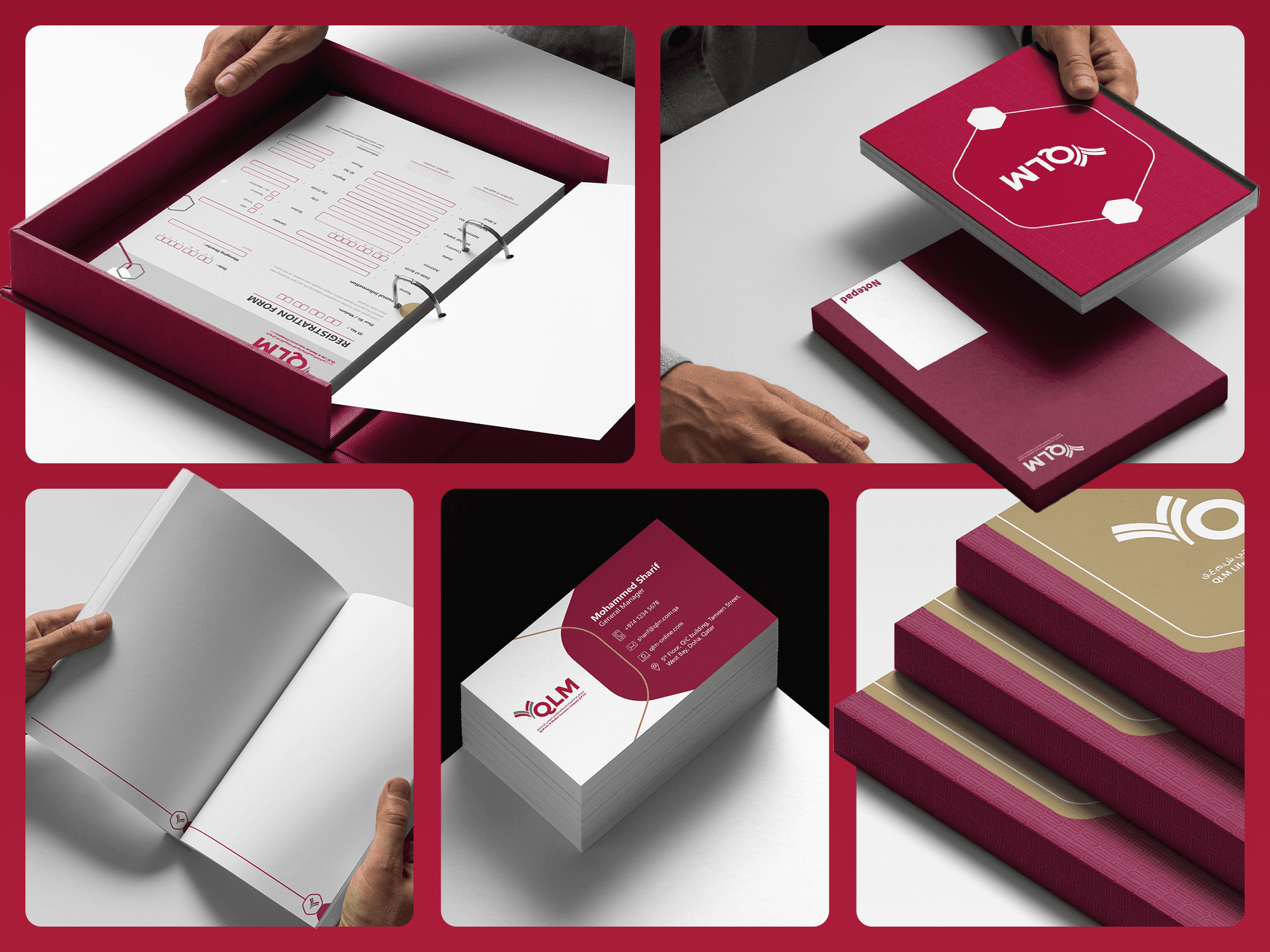
On Print (Corporate Design)
Key Design Elements
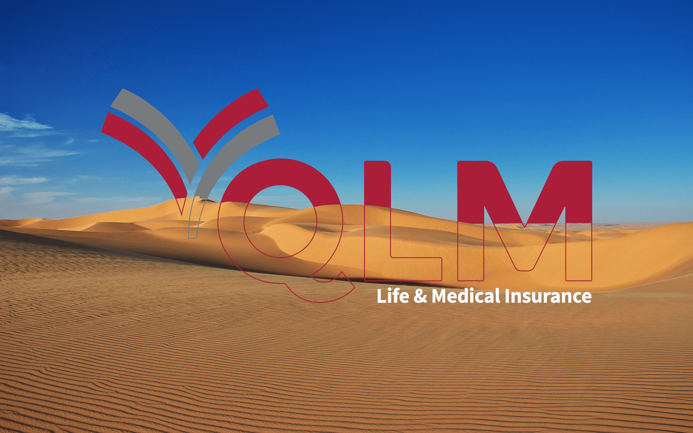
Logo & Symbolism
Inspired by the lotus—symbol of resilience, renewal, and care—the logo balances elegance with purpose. Its soft curves humanize the brand, while the geometric balance ensures professional gravitas.
_______________
Color Palette
Primary Colors:
Pantone 207C (Maroon) — Thoughtfulness, control, trust
Cool Grey 9C — Balance, stability, clarity
Emotive Extensions:
Consumer-facing: Nature, Optimism, Wisdom
Corporate-facing: Sophistication, Reliability, Ambition
Color usage was carefully mapped to create distinct moods across audiences—while maintaining brand unity.
_______________
Typography
Corporate Typeface: Rounded sans-serif font for a friendly and refined tone
Digital Typeface: Clear, legible fonts for seamless web and mobile use
Typography choices reflect approachability without compromising credibility.
_______________
Shape Language & Patterns
Consumer Design: Organic, fluid shapes that reflect the unpredictability of life—adaptable and empathetic
Corporate Design: Geometric, structured forms symbolizing protection, innovation, and legacy
Patterns derived from these shapes provide visual rhythm across all formats.
_______________
Tone of Voice
Warm. Helpful. Personal. Informative. Simplified.
The verbal identity complements the visual system—human, clear, and comforting in all messaging.