#SaluteTheSpirit
for Hinduja Hospital

Problem
Cancer patients, especially those undergoing chemotherapy, often experience hair loss, which can significantly impact their self-esteem and emotional well-being. Despite their immense strength, they sometimes feel isolated in their battle. Society often sympathizes but struggles to find a tangible way to express solidarity beyond words. There was a need for an engaging, impactful, and action-driven campaign that allowed people to stand with cancer fighters in a meaningful, visible way while also contributing to their treatment.
Solution
#SaluteTheSpirit Campaign & App To bridge this gap, P.D. Hinduja Hospital launched an interactive digital campaign where people could take a selfie with a bald filter to show their support for cancer fighters. Engaging Digital Platform: A dedicated app was created, allowing users to upload their selfies, apply a bald filter, and share them across social media to spread awareness. Landing Page for Awareness & Participation: The campaign landing page (as seen in the final image) provided an intuitive platform where users could: Learn about the cause and the importance of supporting cancer patients. Easily take and upload their bald-filtered selfies. View a gallery of shared images to create a sense of community. Encourage donations, with ₹50 contributed per selfie towards the treatment of underprivileged cancer patients. Amplified Impact through Social Sharing: By participating, people not only visibly expressed their support but also encouraged their network to join, making cancer fighters feel less alone in their journey. This initiative transformed passive empathy into active participation, making it easier for people to show their support while directly contributing to cancer treatment.
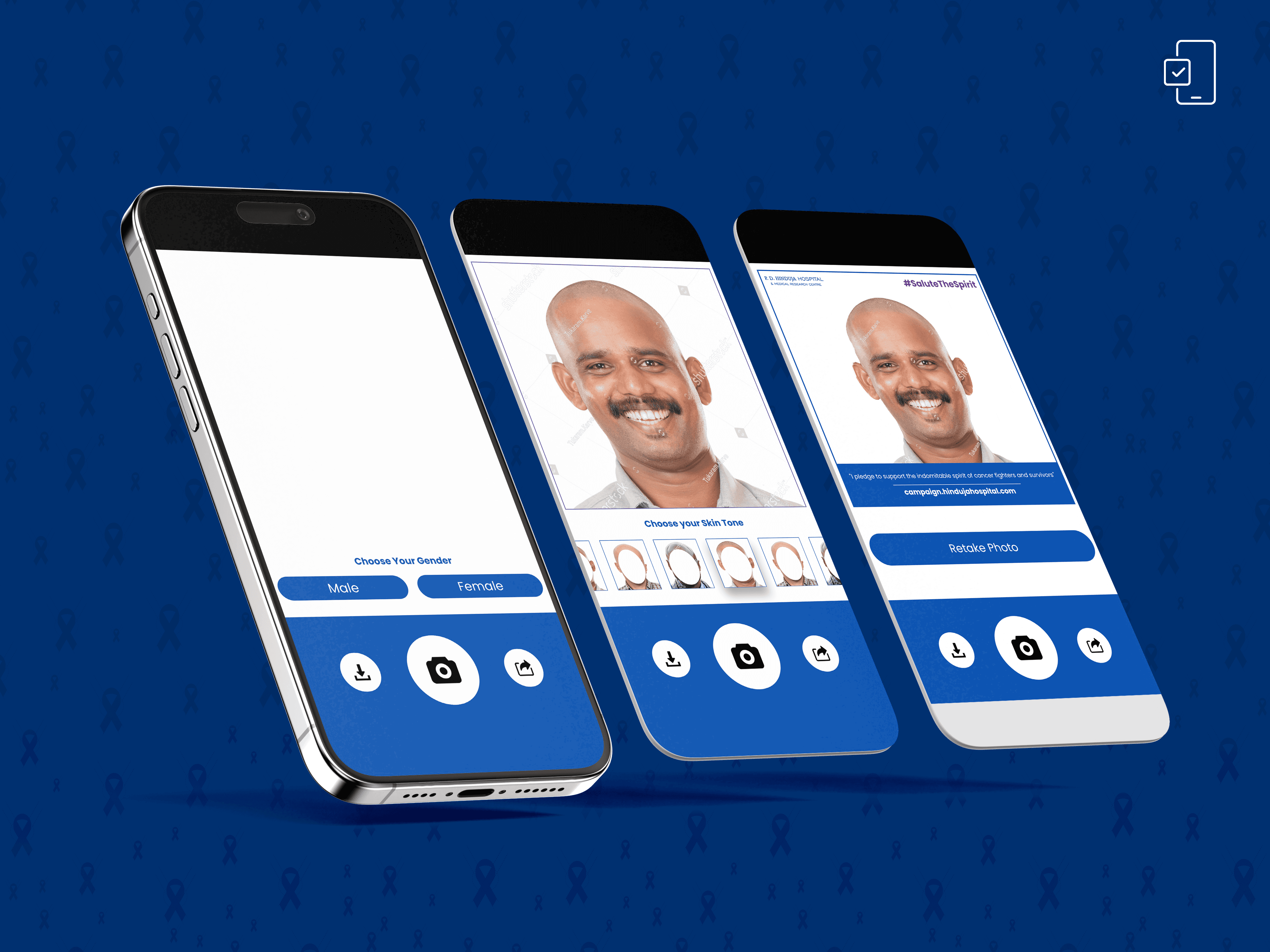

1. Brand Colors & Visual Consistency
Primary Colors Used: Deep blue, white, and purple.
Consistency: The app's buttons, text, and call-to-action sections maintain a uniform color scheme, reinforcing brand identity.
Emotional Connection:
Deep blue evokes trust, professionalism, and dependability, which is crucial for a medical/hospital-backed campaign.
Purple (#SaluteTheSpirit hashtag) represents strength, support, and resilience, aligning with the cause.
2. User Experience & Functional Design
Step-by-Step User Flow:
First screen: Users select a bald filter that matches their skin tone, making the campaign inclusive.
Second screen: The uploaded/selected image is displayed, allowing users to see the transformation.
Final screen: The branded campaign frame appears, including hospital branding, campaign messaging, and the call-to-action.
Why this works?
Simplicity: Minimal UI distractions make navigation effortless.
Clear CTA: Download and Share buttons are easily accessible, encouraging social sharing.
Emphasis on user-generated content: By allowing personalization (choosing a skin tone, taking/uploading a photo), it fosters active participation.
3. Branding Elements in the Final Output
Campaign Messaging:
The hashtag #SaluteTheSpirit is prominent in purple, ensuring it stands out and remains memorable for social media.
The hospital’s name and logo appear in the top left corner, subtly reinforcing credibility without overshadowing the user’s face.
Typography:
Bold, legible sans-serif fonts ensure easy readability.
Hierarchy:
Call to action ("I pledge...") is given prominent positioning, ensuring the message is clear.
The website link is emphasized, driving users toward further engagement.
4. Social Media Integration & Shareability
The export-ready design includes:
The branded frame ensuring all shared images are instantly recognizable as part of the campaign.
A balanced layout where the person’s face remains the focus, but branding elements (logo, hashtag, message) are still present.
A download/share button setup at the bottom to encourage viral spread.