Xebra
Empowering and digitizing Indian MSMEs enhancing their financial well-being.

Problem
Indian accountants and MSMEs have long relied on outdated accounting platforms like Tally, which, while functional, fail to meet the evolving demands of modern businesses. These platforms are often hindered by unintuitive interfaces, a lack of integrated features for logistics and economic management, and uninspiring designs that lead to user fatigue. The absence of a user-friendly and visually engaging solution makes financial management cumbersome, especially for MSMEs seeking efficiency and innovation in their operations. This disconnect has created a pressing need for an accounting platform that is not only robust and versatile but also designed with modern aesthetics and usability in mind.
Solution
Xebra addresses these challenges by introducing a comprehensive platform tailored to the unique needs of Indian MSMEs and accountants. The solution began with the creation of thoughtful wireframes that carefully mapped user workflows, prioritizing simplicity and functionality. The interface was designed to incorporate a vibrant color palette, breaking away from the monotonous black-and-gray screens of traditional software, creating an engaging and stimulating user experience. The platform’s UI and UX were crafted with a spacious and intuitive layout to minimize complexity, enabling users to navigate easily without feeling overwhelmed. Each feature is positioned to enhance accessibility, with clear visual hierarchies and ample space between elements to reduce clutter. Beyond aesthetics, Xebra integrates advanced tools for logistics and economic management, transforming the platform into an all-in-one solution for MSMEs. This holistic approach empowers users to manage their operations effortlessly while improving their financial well-being, making Xebra a forward-thinking alternative to legacy systems like Tally.

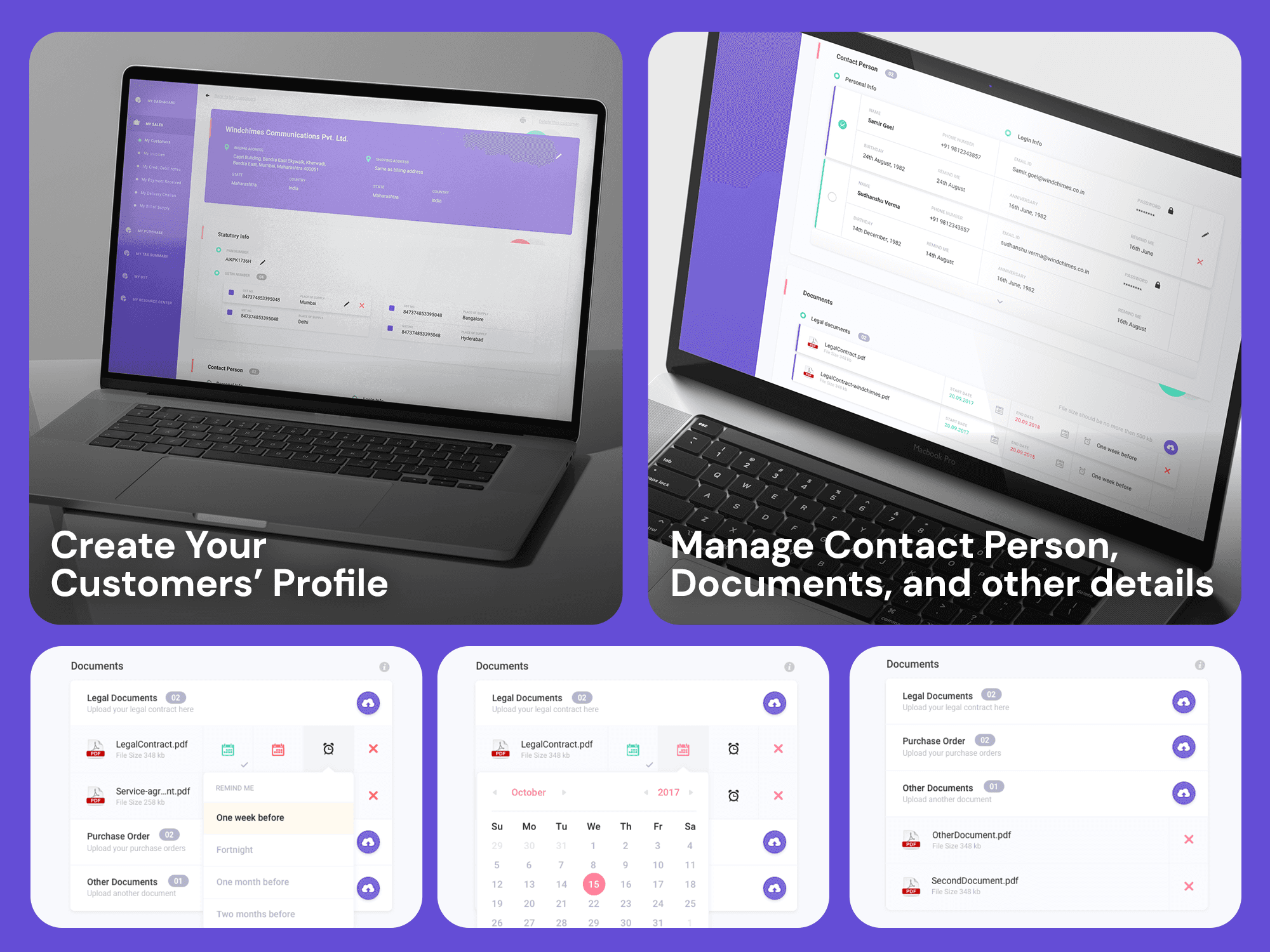
1. UI/UX Design
Clarity and Structure: The layout is clean and well-structured, with a clear flow of information from top to bottom. This ensures users can easily navigate through the page without feeling overwhelmed.
Visual Hierarchy: There is a strong emphasis on important elements like calls-to-action (e.g., "Start your free forever plan right now"), ensuring they grab the user's attention.
2. Widgets and Functional Elements
Interactive Charts and Graphs: The use of graphs and charts to visually represent business analytics is engaging and user-friendly.
Feature Blocks: Clear segmentation of features (e.g., bookkeeping, B2B solutions) with accompanying icons makes it easy for users to understand the platform’s offerings.
Comparison Table: The comparison of "Xebra vs. Competitors" is a great addition to build trust and showcase value differentiation.
3. Font Hierarchy
Readable Typography: The fonts are easy to read, with proper size variations between headings, subheadings, and body text.
Consistent Usage: Font styles are consistent, reinforcing professionalism and making the content scannable.
4. Color Scheme
Vibrant and Professional: The use of purple as the primary color is vibrant and modern, creating a professional and approachable vibe. The additional use of green and white provides a good contrast.
Accent Colors: Bright accent colors for buttons and highlights draw attention to key actions without being distracting.
5. Ease of Access
Quick Navigation: Clear call-to-action buttons placed at regular intervals encourage users to take immediate steps (e.g., sign up, compare plans).
Spacious Design: Ample white space between sections avoids clutter, making the interface breathable and intuitive.
Tooltips/Highlights: Visual guides and labels accompanying key features enhance usability.